PROJECT: “Modern Transcriptions - Geometria Office Building and Vision Towers”
Awards:
2015. Architectural Award for Excellence
Project: Geometria Office Building, Budapest
2014. Building Industry Award for Excellence
Projekt: Geometria Office Building
2012. Building Industry Award for Excellence
Project: Árkád Shopping Centre, Szeged
2011. Resource Property Award „Project of the Year”
Project: Árkád Shopping Centre, Szeged
2010. Media Architecture Awards – Audience Prize
Project: Institute for the Physically Disabled, Budapest
Nominations:
2011. Piranesi Award
Institute for the Physically Disabled, Budapest
2011. Mies van der Rohe Award
Institute for the Physically Disabled, Budapest

Katalin Csillag is one the leading designers of 3h architecture. From 2008 she is member of the Master School. She has completed her studies in architecture at the Technical University, Budapest. She got her degree in 1992. She has worked as an architect in Graz by Helmut Zieseritsch between 1992 and 1994. In 1994, she founds 3h architecture with Zsolt Gunther. She finishes the Master School in 2002. Lectures, reviews as visiting architect, contributions to exhibitions in Europe (Budapest, Pécs, Vienna, Linz, Berlin, Amsterdam, Rotterdam (NAI), Copenhagen).
Presentation Geometria Office Building – The project won the Architectural Award for Excellence this year.
Project informations:
Name of the project: Geometria Office Building
Location: Medve Street 17, Budapest
Client: Geometria Ltd.
Design Architects: Katalin Csillag and Zsolt Gunther (3h architecture)
Project Architect: Orsolya Pataj
Project Team: Zsombor Fehér, Lilla Kántor, Bence Kertész, Rita Madarasi-Papp, Orsolya Pataj, Tímea Szarka
Status: project – 2010, realization – 2013.
Void-In, Void-Out
„At first sight, this building does not look like a building. The windows are replaced by patterned glass surfaces, one can see jumping-off segments instead of a flat facade; no entrance, no roof, no driveway. Despite its simplicity, this building is quite unusual in the Hungarian architectural context with boxes put upon one another breaking up the closed streetfront.”
(Dániel Kovács: Medve Street Pride. In: Magyar Narancs, 15.08.2013.)
This small office building is situated in a densely constructed Budapest neighbourhood close to the Danube, where the streets are connected to blocks in a gappy way, there are alternating heights, as well as stylistically heterogeneous streetscapes. Our building relates and is without reference at the same time: it ignores the height of the building right next to it, but conforms to the ridge of the firewall behind it, creating a unity beyond trivial neighbourly relations.
The building follows an apparently strict, tense geometry. Its prism-formed mass is distinguished by salient and retreating surfaces following a chessboard pattern. The outer plain has a holey disk pattern which is intentionally extravagant and reminiscent of seventies pop culture. Thus, the apparent transparency of the building is misleading: it does not correspond to a link between the exterior and the interior. Rather, the glass becomes an instrument of separation. And since it separates, the properties of the glass also become important: the vertical surface functions as a large mirror and thus a tool of virtual multiplication.
The strict exterior continues in a geometrically structured but pulsating interior. The inside world of the building is organized around an atrium which receives natural light from above, it is elongated and articulated by building boxes shifting positions on each floor. All relevant spaces are visually linked to this inner atrium. The glass boxes poking into the atrium seem to float in a tight yet airy space. Open-space and cell-like offices alternate with each other level by level. Cellular offices have solid parapets while the open-space offices are separated from the atrium by walls rising to the ceiling. Light alternates with weight, transparency with blind spots.
The building successfully combines passive and active “green” principles. Heating and cooling is provided by a low temperature water-system fed by an air heat pump. It can be ventilated through the glass roof of the atrium and the meeting halls on the ground floor which open directly to the garden. The solid parts of the roof will be turned into green roofs which can also be adapted to hold solar panels in the future. The most important principle of the interior design was sustainable comfort. One of the pillars of this strategy is natural light penetrating into every corner of the building.
Presentation Vision Towers Office Building, at INGLASS Budapest
Project informations:
Name of the project: Vision Towers Office Building
Location: Váci út 29-31., Budapest
Client: Futureal Development Holding Ltd. and KPMG
Design Architects: Katalin Csillag and Zsolt Gunther (3h architecture)
Project Architect: Tamás Békesi
Project Team: András Márk Bartha, Zsombor Fehér, Lilla Kántor, Bence Kertész, Anna Sára Kiss, Tamás Németh, Orsolya Pataj
Status: project – 2011, realization – 2014.
„We can discover an important aesthetic factor, a common denominator in connection with the recent buildings of 3h. It seems that finding the right structure and architectural design are the origin of pure beauty, overwhelming critic and laymen as well. There is no humbugging just the minimalist aesthetic coming from low-keyed, quietened sounds.”
(József Martinkó: The Shining of Clear Mind. In Octogon, 2015/2. 118. sz.)
There is a peculiar spot on the northeastern office corridor in Budapest: a crossroad cuts in the orthogonal urban tissue. Thus the building mass recesses compared to the other buildings on the corner. This can be interpreted as a backyard situation, which gets into central position by the curve of the crossroad. In this place, the focal point coming from the irregularity of the urban tissue had to be created by designing a freely shaped building.
The slabs that follow the racionality of the office tipology open up in a fan-like shape in the direction of the open space. Two of them thus follow the orthogonality of the urban tissue. The third element is wedged in between the two and redefines their seemingly simple relationship.
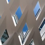
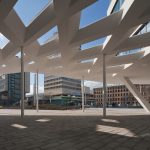
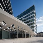
The office blocks follow the curve of the street, the mass gradually steps down towards the lower residential units. Dynamism is an essential principle that becomes obvious on the move: the prisms designed in a stirct geometric order sometimes cover each other, sometimes unfold themselves. The variation of the positive and negative spaces, the turning of the sloping blocks are part of the illusion that becomes obvious by circuiting the building. The canopies stretch between the office slabs, their rhombus shaped openings become more and more spacious towards the building’s inner side. The shapes of the lower and upper plane alter so that their intercept changes consistently, it sheperds the light towards the inner, darker parts. The geometrical trick makes for airiness and levitation, thus the sculptural surface does not seem to be heavy.
The idea of the progressive transition appears also on the facade. The glassed surfaces appear on the prisms like ribbons, although the proportion of the glassed and solid parts differs in each block. The northern block is glassed from floor to ceiling, the windows of the next block are at the usual parapet-height, while on the southern block there are significant solid zones.
The building’s garden has a rich flora, it evolves from prismatic mounds, and this solution has not only aesthetical, but environmental friendly effects as well, since the garden funcitons as a sound-proof wall or rather a dust-filter by the means of its terraced structure and its flora. The passengers’ and cyclists’ path leads along an area that is open and closed at the same time by the fan.
PHOTO GALLERY


